


The Brief:
Develop a brand identity for High Desert Studio that compliments Jordan’s reposeful and earthy art style. Design print and digital elements that serve to enrich the HDS customer experience and overall brand perception whilst highlighting the artwork itself.

Direction No. 1
Earthy Elegance
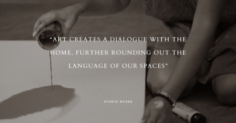
This direction exudes a laid back luxury that feels upscale without being too polished and perfect. The fractured type motif seen throughout the collateral is meant to capture the essence of the artist’s mind as thoughts and ideas drip onto the canvas. Rejecting the traditional grid, the fluid word layout creates an individual and empowered look. Applied to various textures and laid out with plenty of white space, this direction serves to elevate the art on display without distracting from it.


Direction No. 2
Poetic Prose
This route houses any artwork on display in a gallery-like setting, providing a rustic theme throughout to enhance the peaceful nature of Jordan’s work. The logotype’s serif letter forms create a sense of institution and are contrasted by the light and airy spacing between the letters. The core brand typography combines a serif font to convey the functional structure of the home with a curved sans serif font to reflect the softer side of the soul. The end result is an organic identity with a calm confidence.


Disclaimer: The imagery used in the photos is to supplement the presentation and demonstrate the overall brand concept. We do not own the rights to these photos.


